
The Cover Was the Second Album
Reid Miles designed the look of jazz for a label he barely listened to. The results still teach every art director alive.
Between 1956 and 1967, a commercial designer named Reid Miles art-directed close to five hundred record sleeves for Blue Note, the label whose golden decade this journal keeps circling. The covers, tight type, hard crops, two colors doing the work of ten, are now so canonical that they function as the visual definition of jazz itself: bars and cafes on three continents decorate with them; design schools teach them; the look gets borrowed every time anyone wants to say sophisticated and urban in a single glance. The joke of history is that Miles, no relation to the trumpeter, was largely indifferent to the music. He reportedly traded most of his promo copies for classical records. He designed the sound without consuming it, from session photographs and song titles and whatever the producers told him the record felt like.
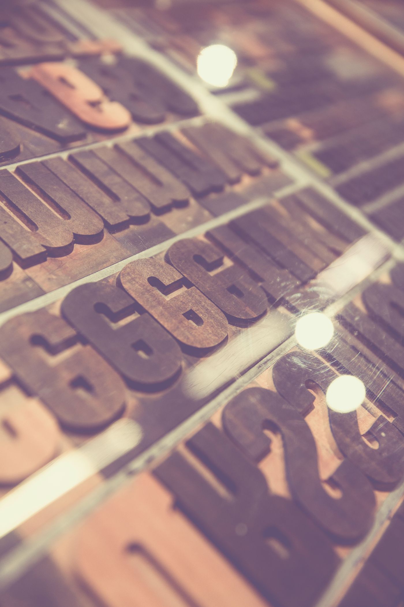
The system had three parts. Alfred Lion and Francis Wolff ran the label, and Wolff, a professional photographer from Berlin, shot the sessions themselves: musicians mid-take, cigarette smoke, sweat, the actual weather of the room. Rudy Van Gelder engineered the sound in his parents' living room and later his purpose-built studio. And Miles took Wolff's photographs and treated them with a brutality no one had applied to musician portraits before: cropping to half a face, a hand, the bell of a horn; tinting the whole frame a single color; then setting type, usually a tight grotesque, sometimes letterpress-flavored slabs, at sizes and angles that made the words part of the rhythm section. The sleeve for Hank Mobley's Soul Station, the type stacking on Freddie Hubbard's Hub-Tones, the split-second cool of Sonny Rollins' Newk's Time: each one is a lesson in how much a designer can remove before meaning collapses, which is to say each one is a jazz solo.
What makes the work teachable seventy years on is its constraint economics. Blue Note was a small label; budgets allowed two-color printing far more often than four. Miles turned the poverty into the signature: a duotone photograph plus one shocking field of orange or cyan reads faster and dates slower than any full-color painting of the era. The lesson generalizes to every discipline this journal covers, the material limit, honestly embraced, becomes the style, and readers will recognize it as the same argument our Listening Room makes about Ahmad Jamal's silences and the same one the house makes about short formulas.
It is worth being precise about influence, because the sleeves' afterlife is bigger than nostalgia. The hip hop generation that sampled Blue Note's basslines also sampled its covers; a canonical run of nineties rap sleeves are direct Reid Miles homages, and the visual language of independent labels, coffee brands, and half the world's boutique packaging descends from his grid. When this journal's own hub page sets a lowercase kicker beside a hard-cropped photograph, the debt runs through sixty years of borrowing straight back to a man laying out horn players he never listened to.
The strangest part of the story, the part the house keeps turning over, is the indifference itself. Intuition says the great music designer must love the music; Miles disproves it. What he loved was the problem: photograph, title, two inks, twelve inches square, ship by Friday. His distance may even have been the advantage, he never illustrated the notes, never got literal, never drew a saxophone when a diagonal would do. He responded to the music's attitude rather than its content, and attitude, it turns out, is the transferable part. The designer who worships the subject makes fan art. The designer who respects the problem makes an identity.
There is a fragrance-house confession embedded here, as usual. A bottle and label are the sleeve of a perfume: the only part most people meet before deciding, the thing that must communicate the record without playing it. The temptation in this trade is always literalism, gold for oud, flowers for florals, and the Reid Miles archive is the standing rebuke: crop harder, say less, let one color carry the weight, trust the buyer to meet you halfway. Every time the house designs a label it asks what the two-ink version would look like, and the answer is usually better.
Spend an evening with the sleeves; the archives are everywhere online, and the show at any good record shop is free. Then flip to the music, Blue Train, Soul Station, Maiden Voyage, and notice the rare, complete agreement between what a thing is and how it presents itself. That agreement has a name in this house. We call it a finished composition, and we spend our working lives chasing the perfume equivalent of a Reid Miles crop.