
Wayfinding Is the Design You Only See When It Fails
Nobody has ever admired a sign that worked. The entire discipline is judged by its absences, which is why it attracts a particular sort of person and produces a particular sort of masterpiece.
Getting lost inside a building is a small humiliation, and it is worth being precise about why. You are not merely inconvenienced. You are made to feel stupid in public, usually while carrying something, frequently while late, and often in front of people who appear to know exactly where they are going. The feeling is disproportionate to the stakes because it touches competence directly. This is the reason wayfinding is not a decorative discipline. It is an applied ethics of not humiliating people, conducted with arrows.
The founding document is Harry Beck's 1933 diagram of the London Underground. Beck was an engineering draughtsman, and his insight was that a passenger underground does not care where the stations actually are. They care about sequence and connection. So he threw away geography, straightened every line to horizontal, vertical or forty five degrees, and evened out the spacing so the crowded centre could breathe. London Transport thought it was too radical and issued it tentatively. It became the template for transit maps worldwide, and the reason is not beauty. It is that Beck correctly identified which information the user needed and deleted everything else.
Massimo Vignelli attempted the same move in New York in 1972 and lost. His subway map is a modernist object of real severity, angles disciplined, colours systematised, geography abandoned. New Yorkers hated it, in part because unlike Londoners they surface constantly and needed the map to correspond to streets, and in part because it took liberties, most famously placing Central Park as a shape that did not match the park anyone could walk through. It was replaced in 1979 by a more geographic design. The map now hangs in museums, which is exactly the fate of a piece of wayfinding that placed system above user.
The most complete national example is British road signage, developed between the late 1950s and mid 1960s by Jock Kinneir and Margaret Calvert. They designed a typeface, Transport, and then did something that had to be argued for: they used mixed case rather than all capitals, on the evidence that word shapes are recognised faster than letter strings at speed. They tested legibility at distance, systematised colour by road class, and drew pictograms with a warmth that has kept them in service for sixty years. Calvert has said the cow on the farm animals sign was based on one she knew from a relative's farm, which is a good reminder that even a national infrastructure system is made by particular people with particular memories.
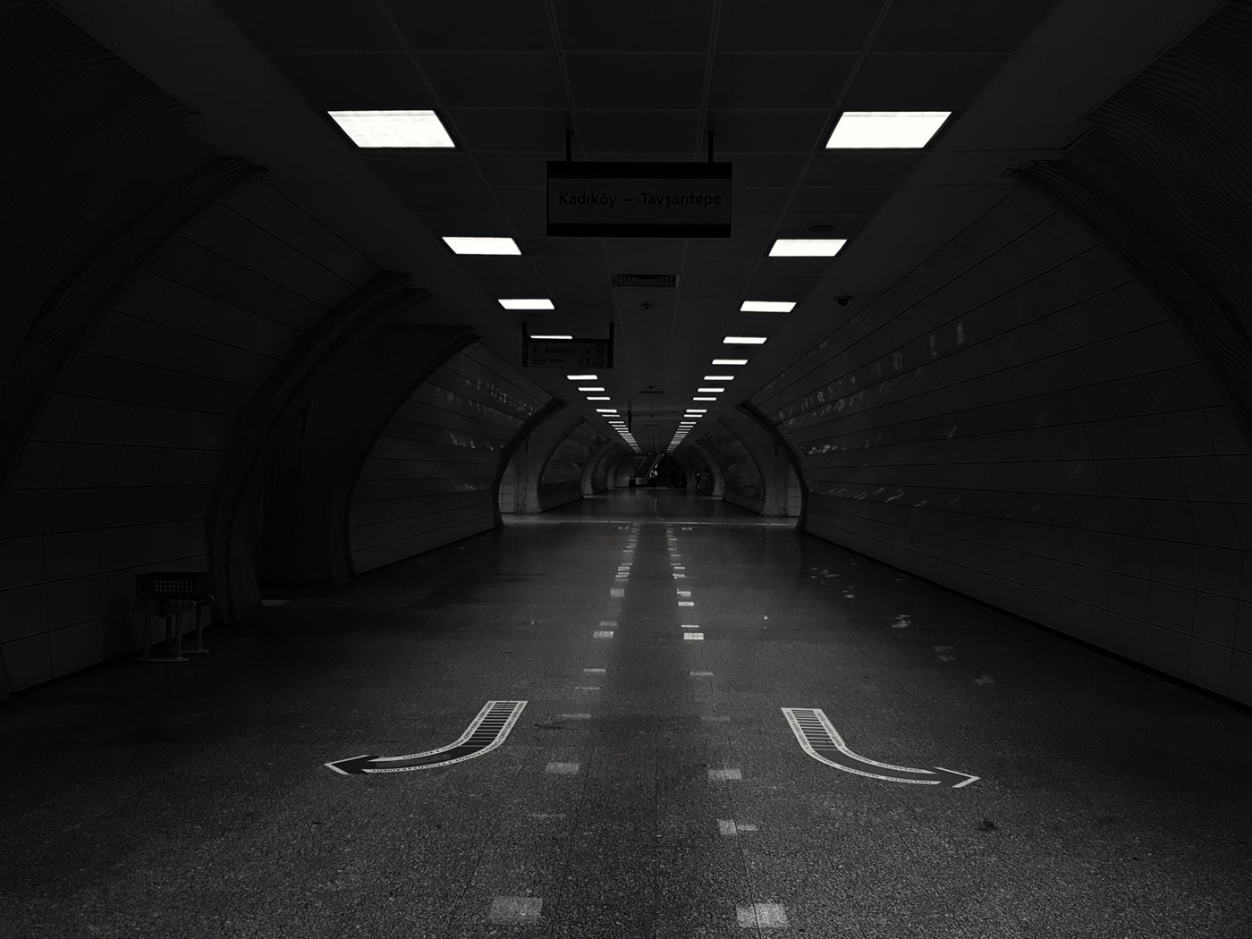
Lance Wyman's work for Mexico City deserves more attention than it gets, because it solved a problem most systems ignore. Building on his identity for the 1968 Olympics, he gave every metro station a distinct pictogram: a grasshopper, an aqueduct, a cannon. The logic was that a system serving a population with varying literacy, in multiple languages, must be navigable by people who cannot read the station name. It is inclusive design executed decades before the phrase existed, and the icons became so embedded that people give directions by them.
Tokyo made a similar concession much later, adding letter and number codes to stations so a visitor who cannot read the name can still verify they are at the right platform. Schiphol standardised on high contrast yellow for primary directional information, a convention now visible in airports worldwide, and the underlying principle is ruthless: one colour means go somewhere, everything else is secondary, and the moment you allow commercial signage to compete in the same visual register the system collapses.
That last point is the most common cause of failure in the wild. Airports and malls and hospitals rarely fail because the signs were badly drawn. They fail because the signage system is one voice among twenty, competing with backlit advertising, retail promotions, security notices and construction hoardings, all of them larger and brighter. Wayfinding requires a hierarchy that somebody has the institutional power to enforce, and in most buildings nobody does.
Hospitals are where the cost becomes measurable rather than merely annoying. A person navigating a hospital is frightened, often unwell, frequently elderly, and the building is typically an accumulation of extensions with inherited numbering that made sense to nobody since 1974. Missed and late appointments follow. Staff spend meaningful portions of their day giving directions. It is one of the clearest cases anywhere of design as a health intervention, and it is nearly always the first budget line cut.
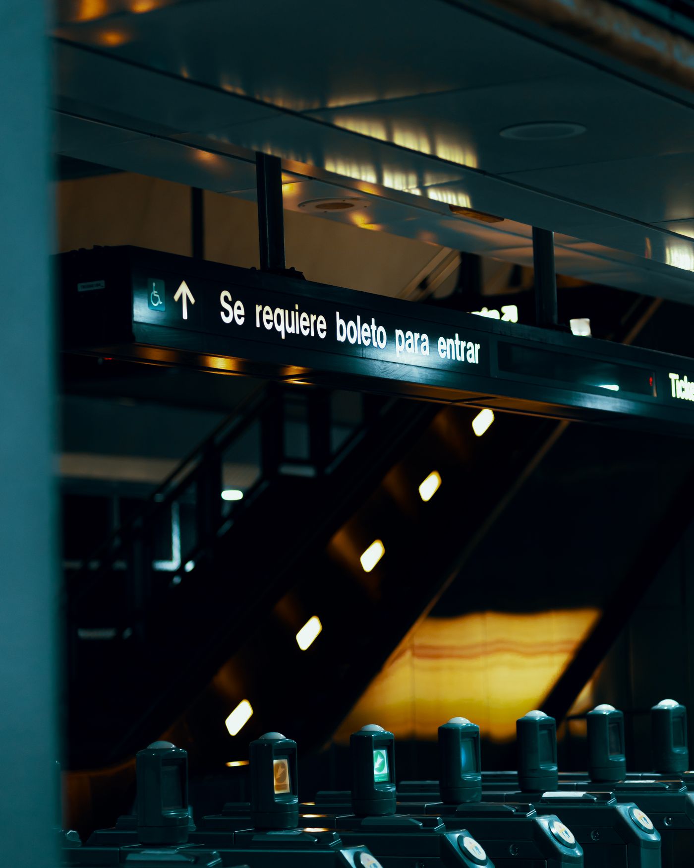
The working principles are few. Answer the question at the point it is asked, not before and not after, which practitioners call progressive disclosure: at each decision point, show only the options available from there. Orient maps to the direction the reader is facing rather than to north, because rotating a map mentally is a skill unevenly distributed and there is no reason to test it. Name things consistently, so that the exit called North on the concourse is not called Main on the platform. Confirm after commitment, with a small sign a few metres along that says yes, this way, because the anxiety of an unconfirmed choice is most of the discomfort of navigation.
And accept the discipline's central injustice. Perfect wayfinding is invisible. Nobody emerges from a station saying the signage was superb; they simply arrive, unbothered, and remember nothing. The work is only ever noticed as failure. Anyone drawn to this field has to find the reward somewhere other than recognition, which selects for a specific temperament: people who would rather be useful than admired.
There is a version of this in perfumery, and it is not a stretch. A composition is a wayfinding system for a nose. The top notes are the entrance sign, legible immediately, telling you what kind of building you have walked into. The heart is the concourse. The base is the destination, and it should confirm rather than contradict what the entrance promised. A fragrance that opens on citrus and dries down to something entirely unrelated has done what a badly signed airport does: made a promise at the door and abandoned the visitor halfway.
Progressive disclosure is exactly what a good structure does. It gives the nose what it needs at each stage and withholds the rest until the moment it becomes useful. Nobody praises a perfume for being well signposted, any more than they praise a station. They simply arrive somewhere, unbothered, and stay.